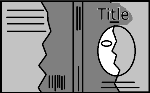
My initial rough sketch and idea for the cover
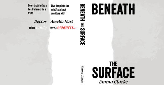
I knew early on I really wanted the split design on the front and back of the cover
I knew early on I really wanted the split design on the front and back of the cover
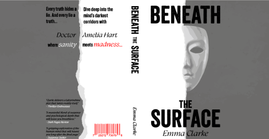
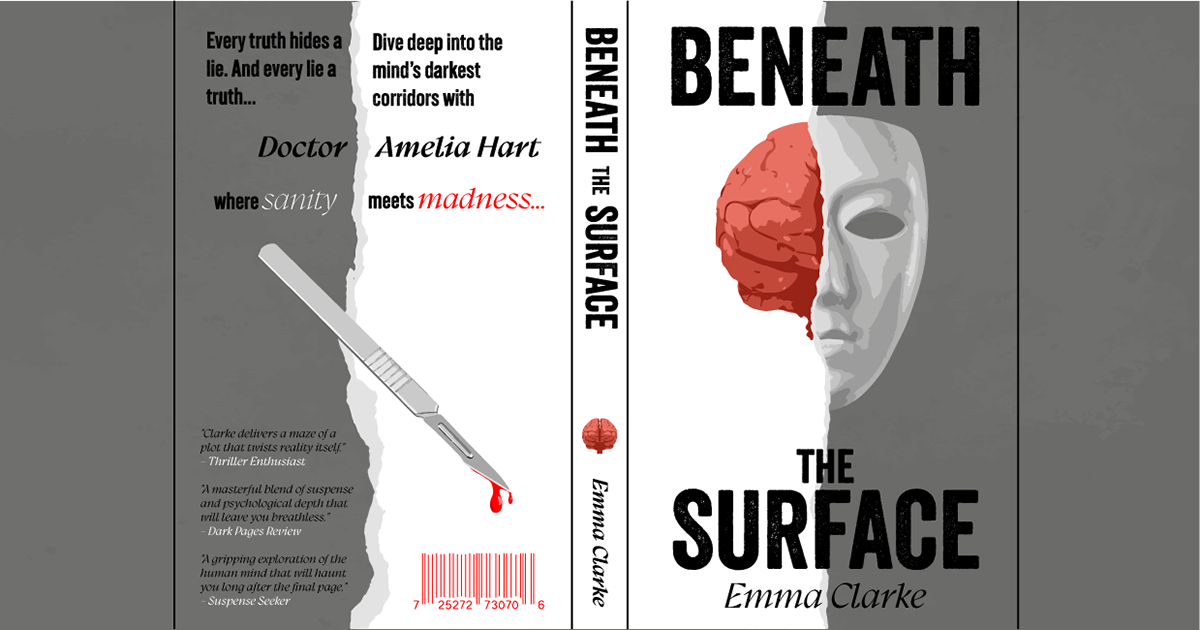
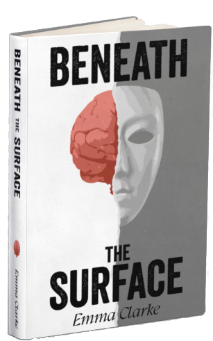
This book cover design for Beneath the Surface visually captures the psychological tension and mystery at the heart of the story. The torn-paper effect divides the cover into two contrasting halves—one dark and one light—symbolizing the blurred line between sanity and madness. The central imagery of a mask merging with an exposed brain hints at themes of hidden identities, psychological depth, and unraveling truth. The scalpel dripping blood reinforces the medical and psychological thriller aspects, suggesting a sinister plot beneath the surface. Typography plays a crucial role in setting the tone, with bold, distressed lettering for Beneath the Surface, conveying unease. The mix of serif and sans-serif fonts, along with contrasting colors for sanity and madness, highlights the novel’s central conflict. Overall, the design aims to intrigue and unsettle the viewer, drawing them into a story that promises suspense, mind games, and shocking revelations.